Hong Kong Land e-Board Game Project
January - May 2019
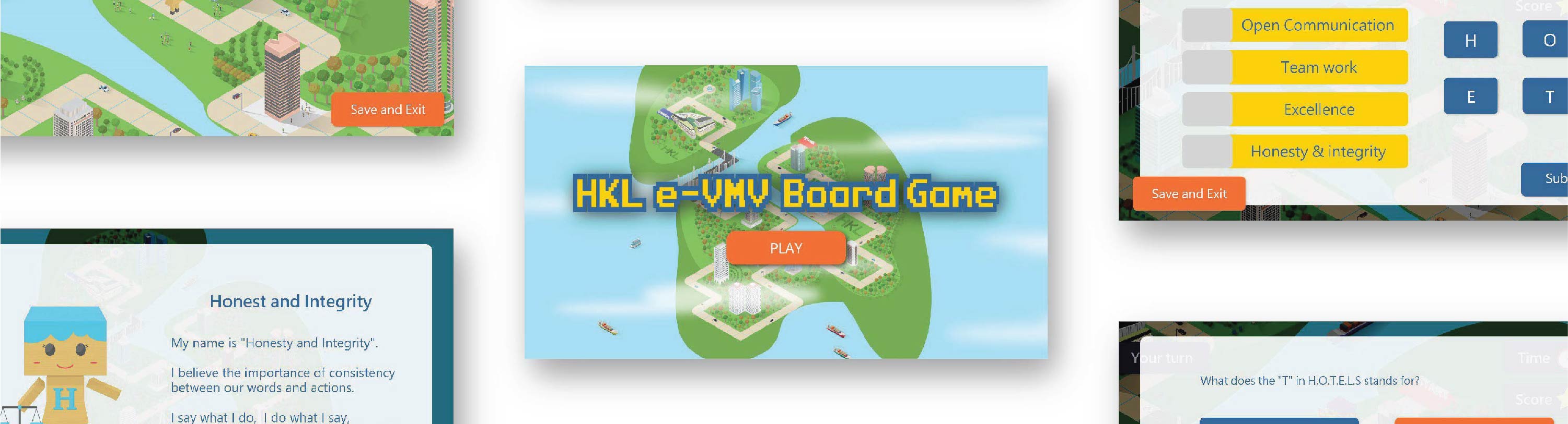
This is an e-board game designed for the new employees of the HongKong Land Limited company (HKL in short) to know more about their company in a more interesting way. When the players walk through the game board, they may need to watch some videos related to their company and answer some questions about that.
Character Design

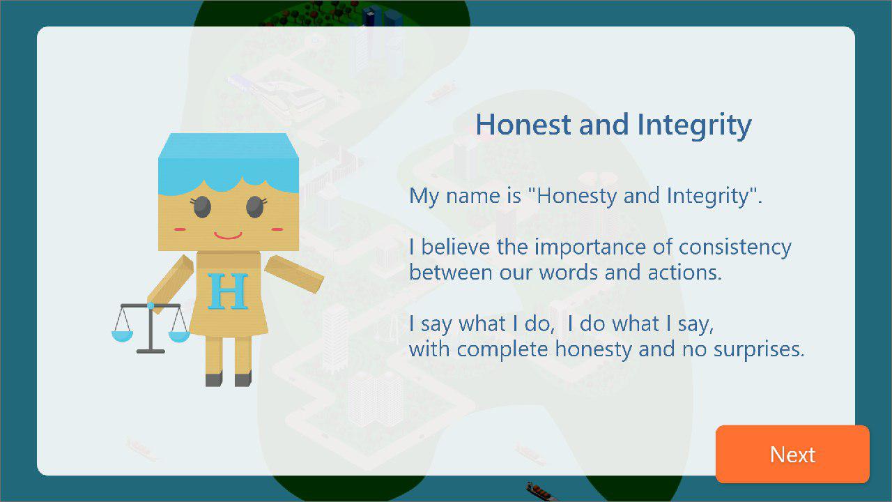
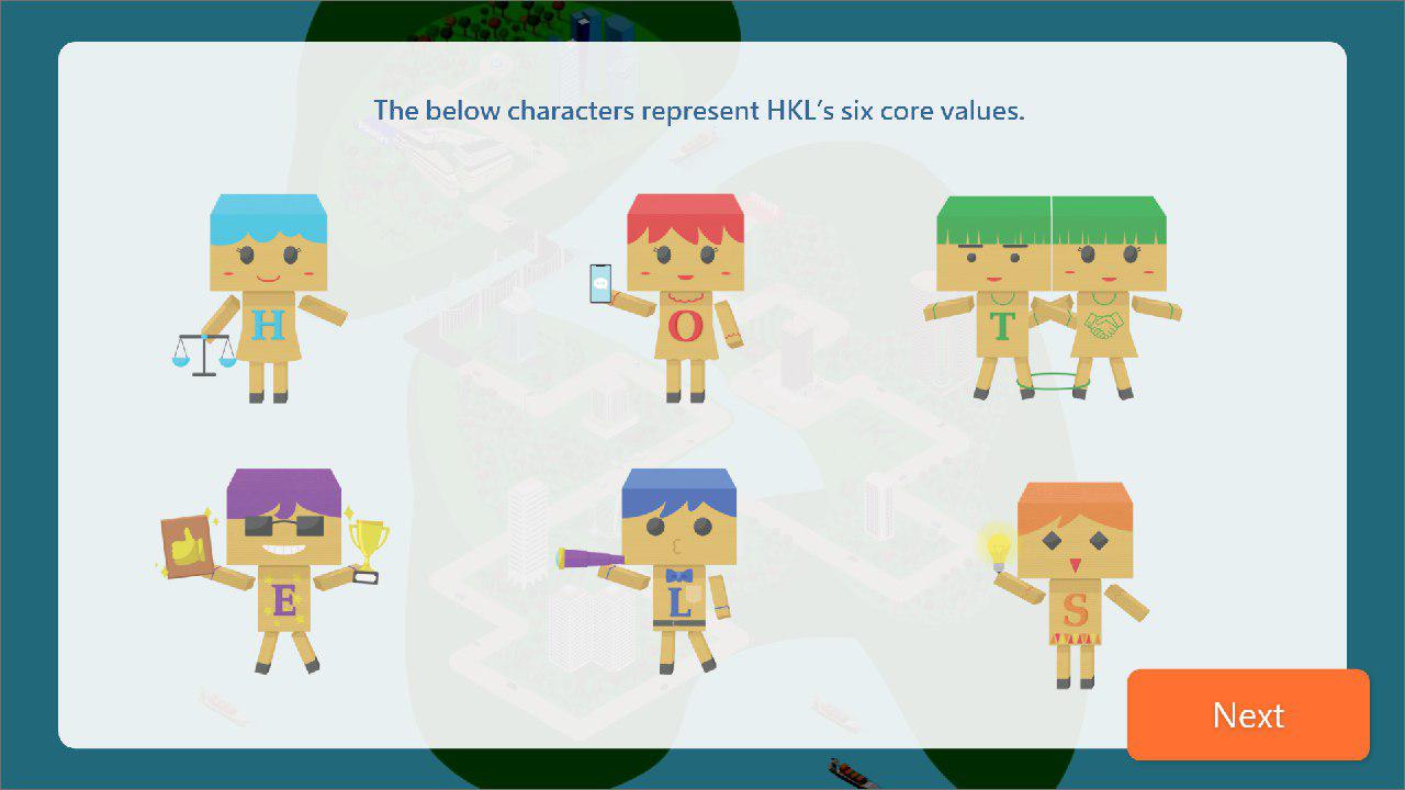
HKL had a concept of using box-man as the character of the e-board game. At the same time, they would like to present ‘sustainable development’ as their principle of development. I suggested making the texture of the box-man like carton, which is recyclable, to include this concept.
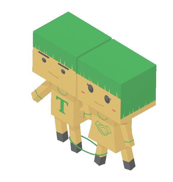
HKL also wished the characters to be ‘joyful’, ‘energetic’ and ‘colourful’ to present the six-core values (Honesty and Integrity, Open Communication, Teamwork, Smart Innovation, Excellence and Long-term) of their company. That’s why each of them is in different colours in a bright tone. Also, the objects holding in their hands echo the core values that they represent. The characters are either smiling or look curious to give a positive impression.
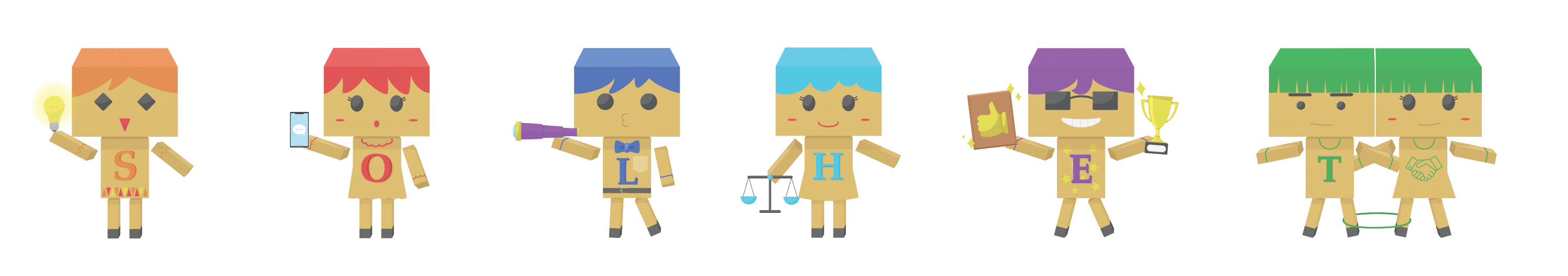
The box-man idea and the six core values were provided by HKL and the protocol of the characters was designed by my colleague. I was responsible for the graphic design, including colouring and texturing of the characters as well as animating the characters. Adobe Illustrator and After Effect were used in the process of character design.
Game Board Design
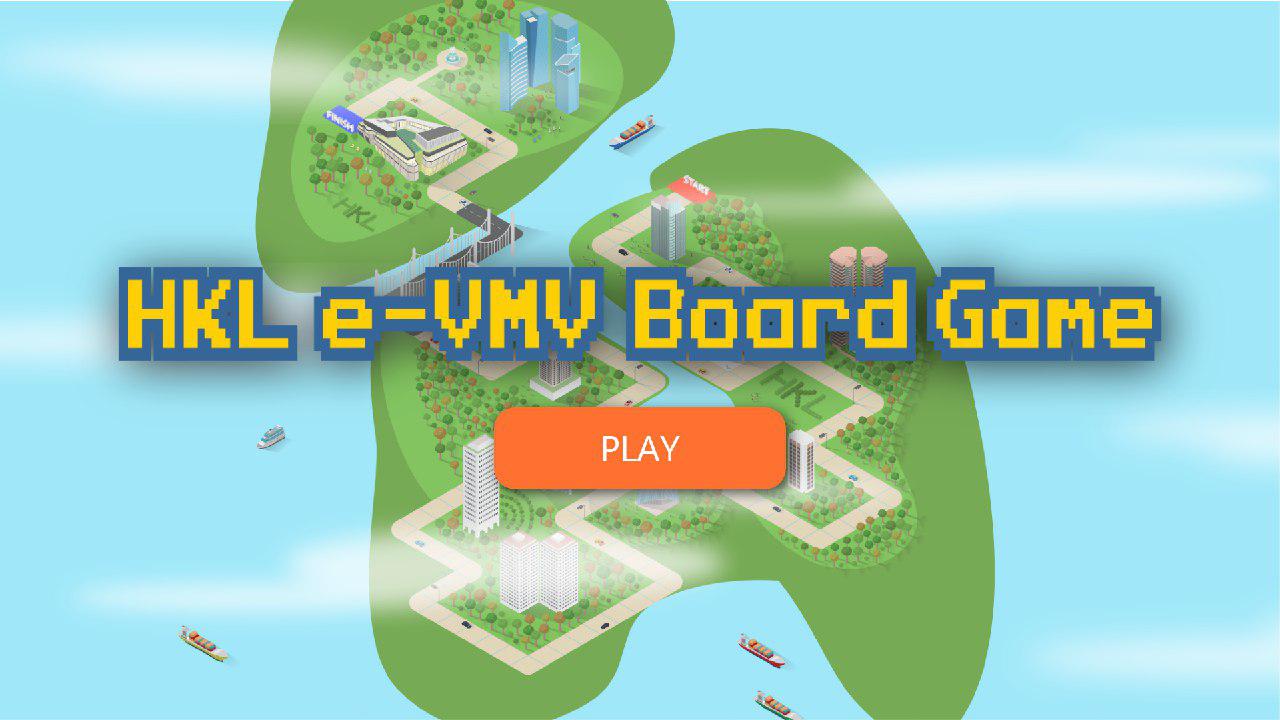
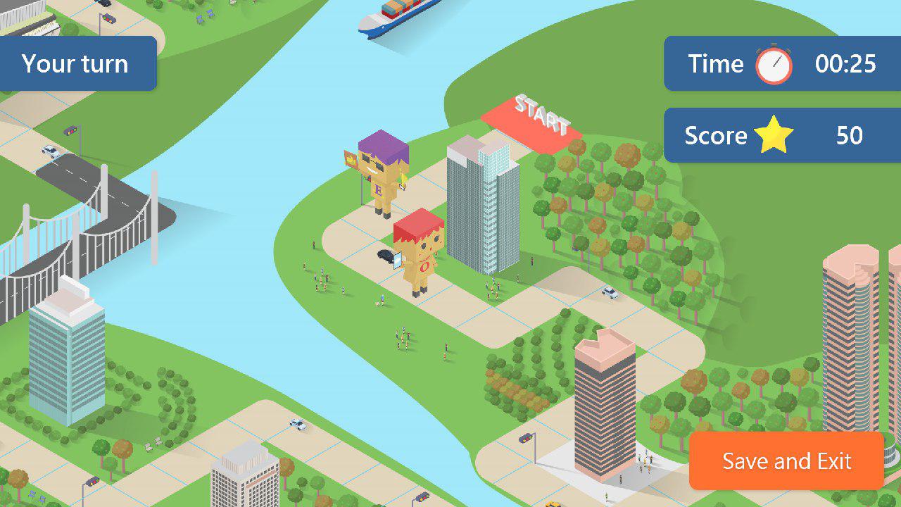
HKL requested an about 120-step game board with their properties, for example, the Exchange square, the Forum, Chater house etc. Ten of the properties are in Hong Kong while two of them are located in Singapore and Shanghai and, thus, they are located on a different island on the game board. The lower island is in H-liked shape to symbolize Hong Kong and HKL, their company name.
Bushes, trees, people, vehicles, Ferris wheel, traffic lights, ships, water fountain etc. were added to make the city look more lively. Bushes that form the words ‘HKL’ were put on each island to indicate the game belongs to and is related to HKL.
The whole game board was designed by me and modifications were made upon requests from HKL.

User interface (UI) Design
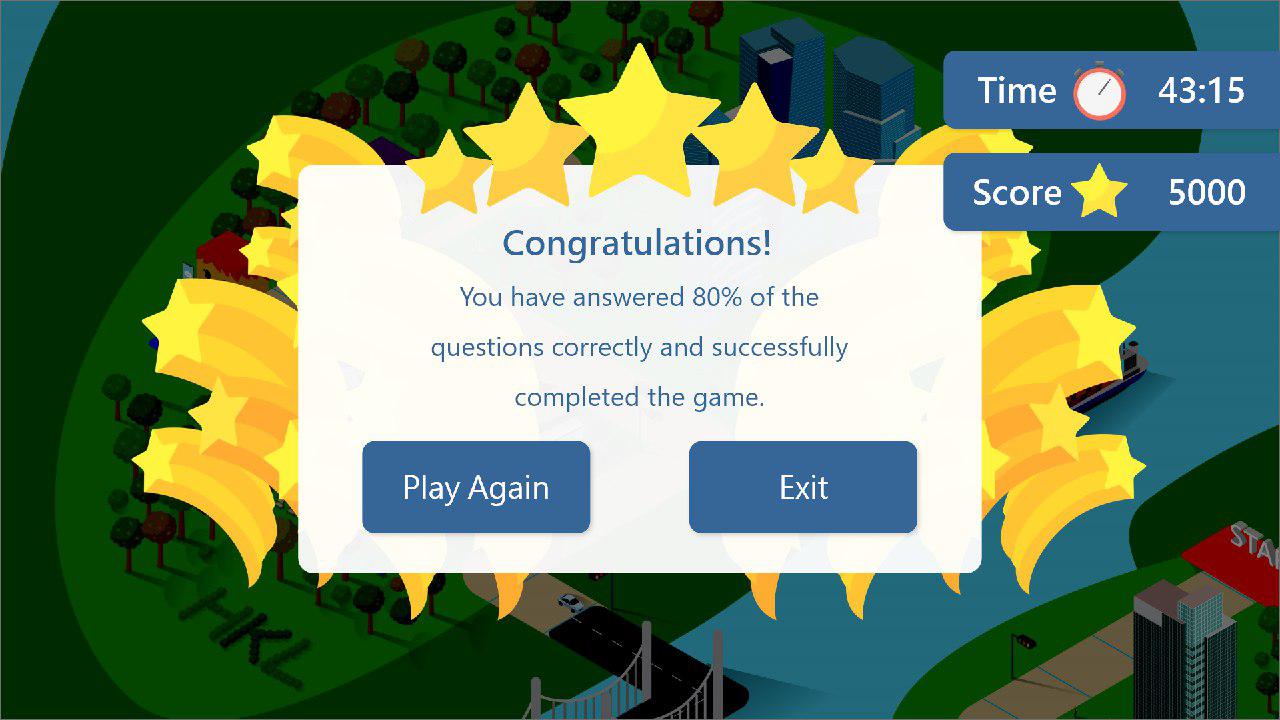
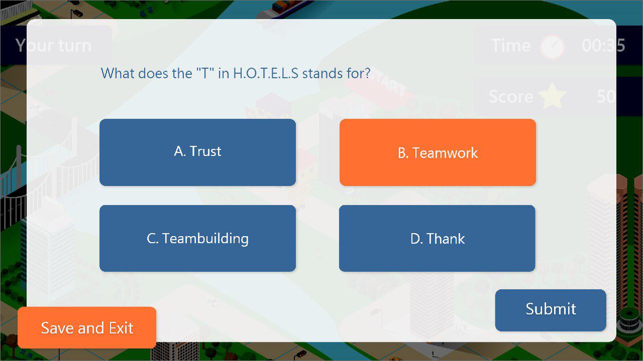
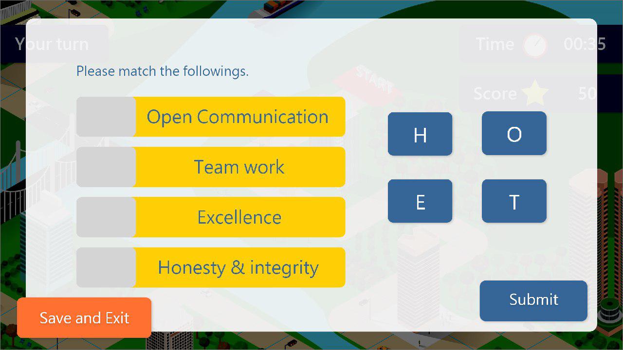
The primary and secondary colour of the UI design are dark blue and orange respectively. Buttons that do not require special attention before clicking are in dark blue (e.g. language, MC options, question level, submit etc.) Buttons that require special attention, for example, save and exit, next and the chosen option of MC question, are in orange. The more eye-catching colour was used to remind the users to save before exit, click to the next step and which option they have chosen.
As proposed by HKL, the players are able to play the game at the same time with the others. Therefore, a ‘Your turn’ indicator is shown on the top left corner. Timer and score are also displayed on the top right corner with the icon of timer and star that the user may know what is indicated even without reading the words.
The background is darkened for the ease of users to read and operate the wheel or in the pop-up window.
The whole UI was designed by me and modifications were made upon requests from HKL.